Good UX design happens when you don’t notice it during or after the experience. The main goal of good UX design is to take the user on a specific mission as quickly as possible, with the least effort possible. In good UX design, very rarely do users notice the mastery they encounter, even in the most simple and most obvious interactions like, for example, deleting items.
“A user interface is like a joke. If you have to explain it, it’s not that good.” — Martin LeBlanc
Simple interactions in the world of UX can turn into user nightmares if enough attention is not paid. Let’s say you’re using Google sheets and you spent hours and hours creating the structure and formulas and adding information, and then by pure accident you click on the trash icon and poof, your work is gone.
All of us have felt this pain at least once in our lifetime, so we all know how hard it is to lose your precious work and how much anger and frustration this experience can cause. That’s why a simple action like “delete” deserves an article for itself.
Why do users delete?
To understand the difference between these two actions, first we need to understand why and what our users want to delete. This largely depends on the context, but again it could be applicable generally. In most cases, users delete because of a need for better organization or a lack of space, or to hide sensitive data, or simply because they don’t want something to be present in the UI.
What’s the difference between delete and remove?
This is a simple definition:
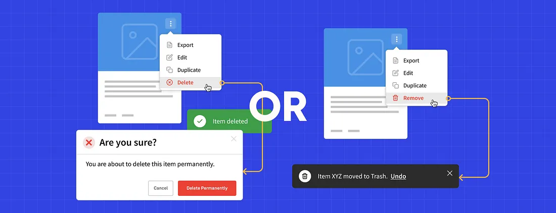
Remove and Delete are defined quite similarly, but the main difference between them is that delete means erase (i.e. rendered nonexistent or unrecoverable), while remove denotes take away and set aside (but kept in existence).
- The New York State
Let’s go through each in order to get a better understanding of both.
Deleting
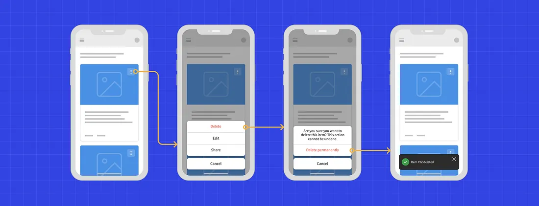
So, let’s go through a typical flow of deleting an item:

Deleting is irreversible, users will lose their files.
In this flow, upon clicking “delete” the user is prompted to confirm whether they want to delete the item or not. Clicking confirm would then delete the item permanently.
This is the most common “out of the box” solution and it’s quite easy to develop. The problem with this flow is that the user’s file is permanently erased from the system and this could lead to user frustration.
Users tend to delete items accidentally but also on purpose only to realize later that they would like to reverse their actions. They may face this situation even after seeing a big warning message that their item is being deleted permanently.
Permanently deleting sensitive data should by all means be implemented as a much more complicated action because it is rarely needed.
Pros:
- Easier to develop
- More storage space available
- Easier to get rid of sensitive data
Cons:
- Permanently lost data
- User frustration
- Rarely needed
Removing
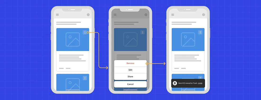
Here is a flow of removing an item:

When removing, files are moved to the trash and stored in it temporary.
Apart from being safer for the user, removing requires less effort as well. Upon clicking “remove” the item is automatically removed and a pop up message appears to inform the user that their item is moved to the trash, and an option to “undo” is available. Usually, items in trash have a “lifespan” after which they are automatically removed permanently. One good example is Apple’s iOS; it does the same when you delete a photo.
Despite being a much safer and easier experience, there is a downside to this flow. Most users are actually not even aware of the “Trash” segment, and usually they either think their data is removed permanently or they cannot find it because in most cases it is hidden.
Pros:
- Losing valuable data is avoided
- Important data can be restored
- Users feel much safer
Cons:
- Harder to develop
- Users are usually not aware of the “Trash”
- Harder to delete sensitive data
UX designers should avoid irreversible actions. The truth is if you add a big warning message like, “Are you really really, 100%, absolutely sure you want to delete this file?” a lot of users will still click “Yes” and later realize that they made an irreversible mistake and loose important data despite the dialog.
Good UX experience should feel safe and trustworthy — the user shouldn’t be afraid to do something, nor should user actions create a negative impact on other aspects of the application. Irrevocable actions should be “hidden” and hard to do.