Using Tableau to build interactive data visuals

Data visualisation is a core skill in any data scientist’s arsenal. The volume of data generated in any enterprise is enormous, and making timely executive decisions relies on having all the relevant data and most current analysis available at your fingertips. In many organisations, this critical task of data presentation is done through the use of automated dashboards, such as with Power BI or Tableau. Provided the source data is updated regularly, these visualisation tools will automatically generate the required graphs and plots for whatever metrics need tracking.
Dashboards are an example of an integrated narrative approach to data visualisation — the user is encouraged to explore the data for themselves, and gather insights for their own purposes. These types of visualisations allow viewers to study the data and discover key insights on their own. Business intelligence applications like Power BI and Tableau are prime examples of this form of storytelling, where interactive dashboards allow the viewer to dive into the data with minimal guidance.
In this article, I want to run through three examples of data visualisations I created using Tableau Public. Tableau Public is a free service for anyone who wants to create their own interactive dashboards — with the caveat that all visualisations generated are publicly accessible (a licensed version of the application is also available, which would be more suitable for confidential data). I’ve included links to all the dashboards I’ve generated here if you’d like to explore the data in your own time.

Dashboard 1: Professional Salary Analysis
The first dashboard I’ve prepared displays metrics of various salaries across different experience levels, education levels, and job fields. These salaries were taken from a small subset of users on Glassdoor — the original dataset can be found here on Kaggle. This kind of dashboard would be especially useful for job seekers and HR workers alike, as it gives a quick insight into the kind of salary ranges and demographics seen in the jobs market. To explore the data in this dashboard, you can view it here.
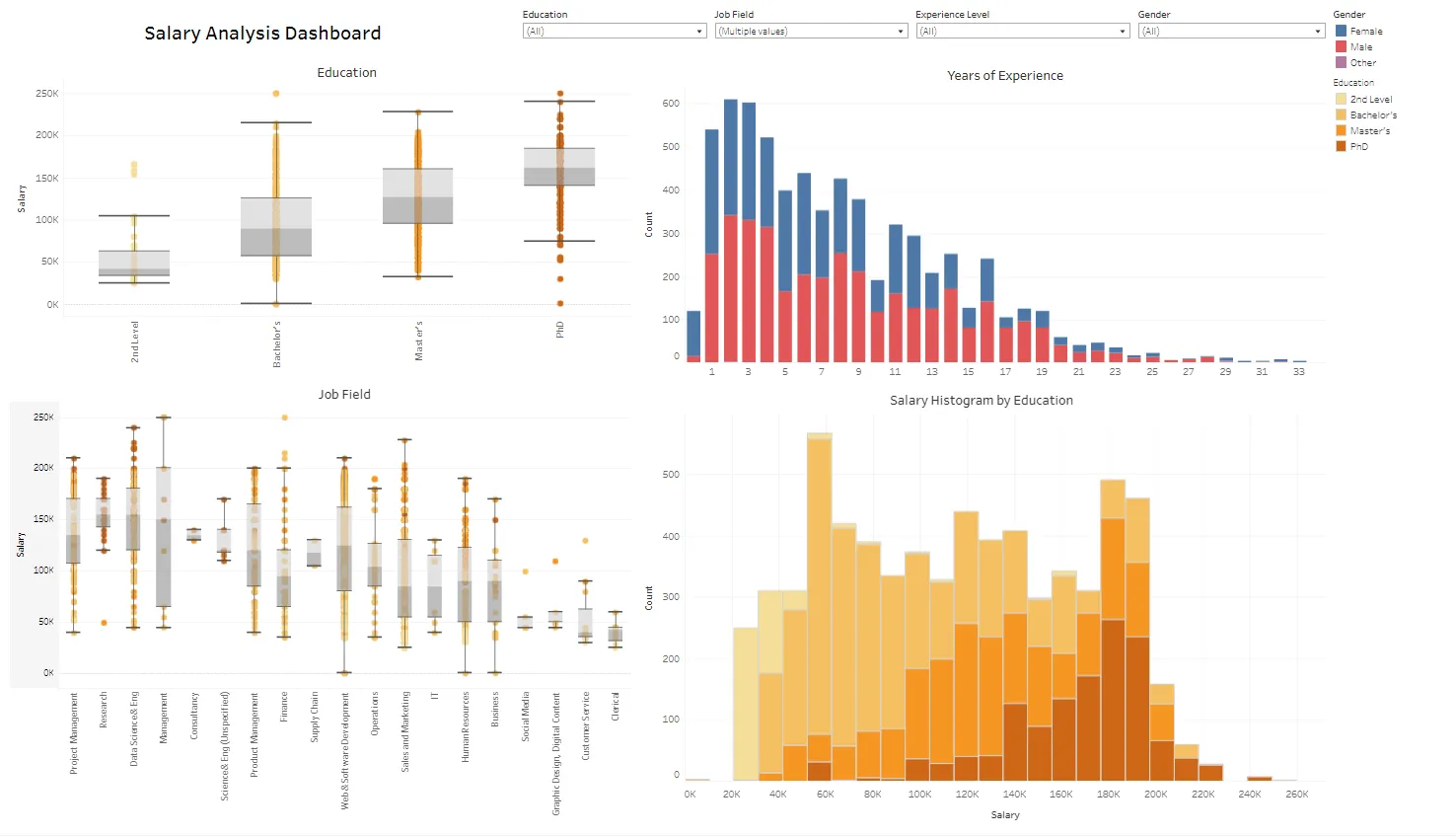
Salary analysis dashboard
I’ve included box plots of education and job role versus salary, along with a histogram of individuals by experience level (segmented by gender), and a histogram of individuals by salary bucket segmented by education level.
The dashboard is filterable by all data features— if I wanted to only look at individuals with doctorates, I can select the PhD bucket on the box plot and the other visuals adjust for the filtered data.
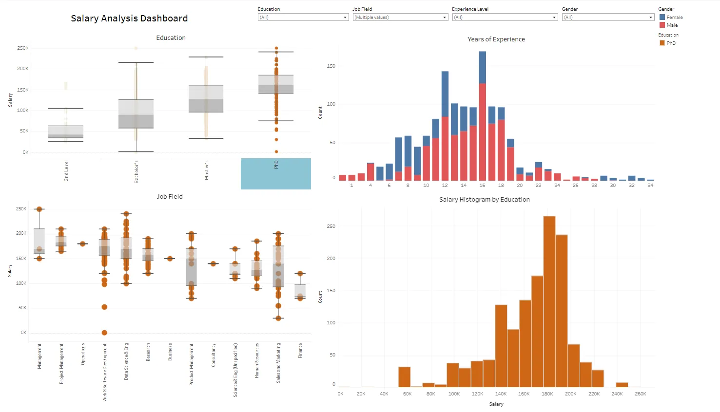
Dashboard filtered for PhD
Looking at these visuals above, we can glean some interesting insights:
- Median salary increases with education levels across all relevant sectors, with those holding a PhD taking the top buckets in the salary histogram.
- The overall survey is rightly skewed in terms of experience level, with the most common respondents having 2–3 years of experience. This may introduce bias in any decisions based on this dashboard — ideally a more proportionate survey should be taken for a better analysis (thankfully all visuals update immediately once additional responses are collected in the source file).
- Unsurprisingly, research positions are dominated by those with PhDs — though we also see a large portion of doctorates working in web/software development, and in sales/marketing. It also appears that there’s a heavy gender imbalance in the PhD respondents, with far less women in this bucket than men.
These are just some examples of analysis from this salary dataset — additional analysis may reveal more trends in salary data across the various data features.
Dashboard 2: New York City Eviction Trends, 2017-Present
The next visualisation I created was a dashboard showing eviction trends in the New York municipal area, across the city’s five Boroughs. The original dataset was sourced from the New York City Open Data Portal, which can be found here. This dashboard would be particularly useful for those working in the municipal government or a non-profit, looking to reduce eviction trends across the city for example — you can follow the link here to explore the visuals in this dashboard.
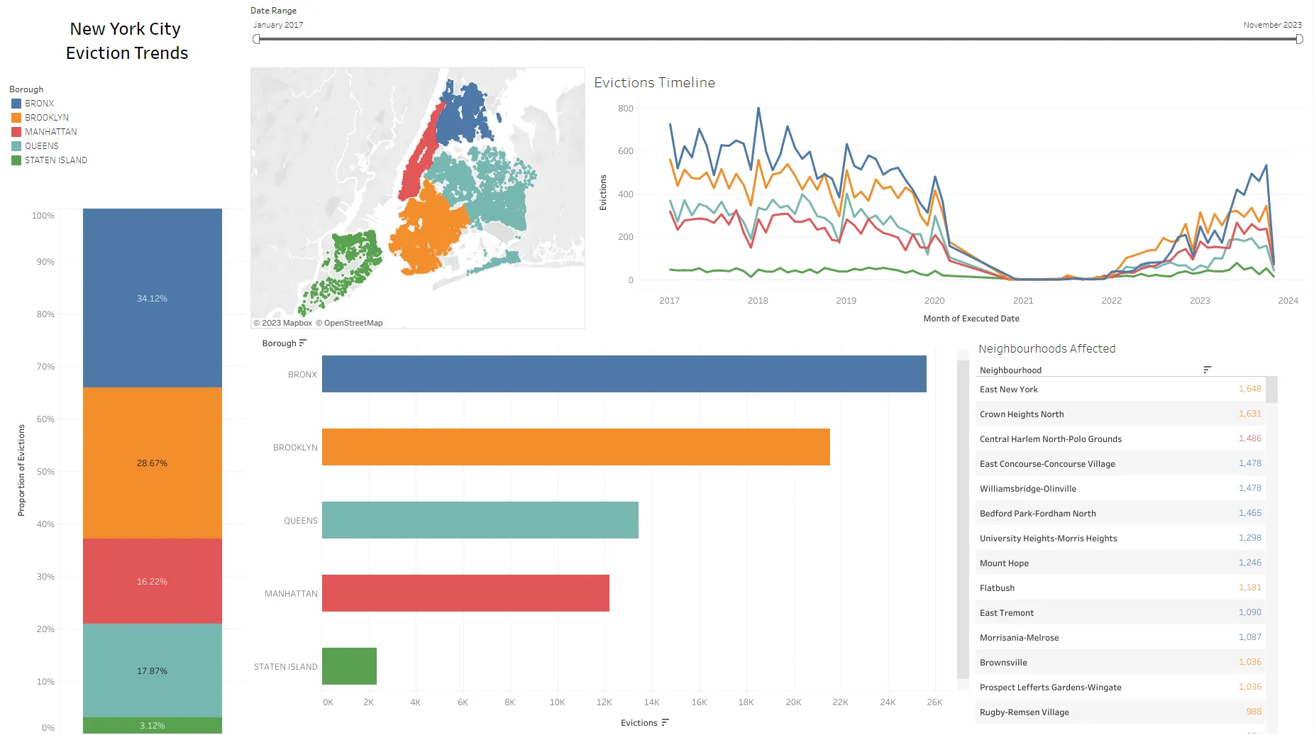
New York City Evictions trends, 2017 — Present
For this dashboard I’ve included a map of all locations where an eviction was recorded in New York City over the last 6 years, bar plots of evictions per Borough (which can also be expanded to show evictions at the district or neighbourhood level), a line graph showing historical eviction trends by Borough, and a list of neighbourhoods ordered by the most affected. A slider at the top of the dashboard makes it possible to choose a range of dates for analysis.
The data and visuals are filterable by time and location — in the screengrab below I’ve filtered the visual to only look at Bronx evictions in 2019. Much like my earlier example, all other visuals adjust for the filtered data — for example, note how the map now only includes the Bronx Borough.
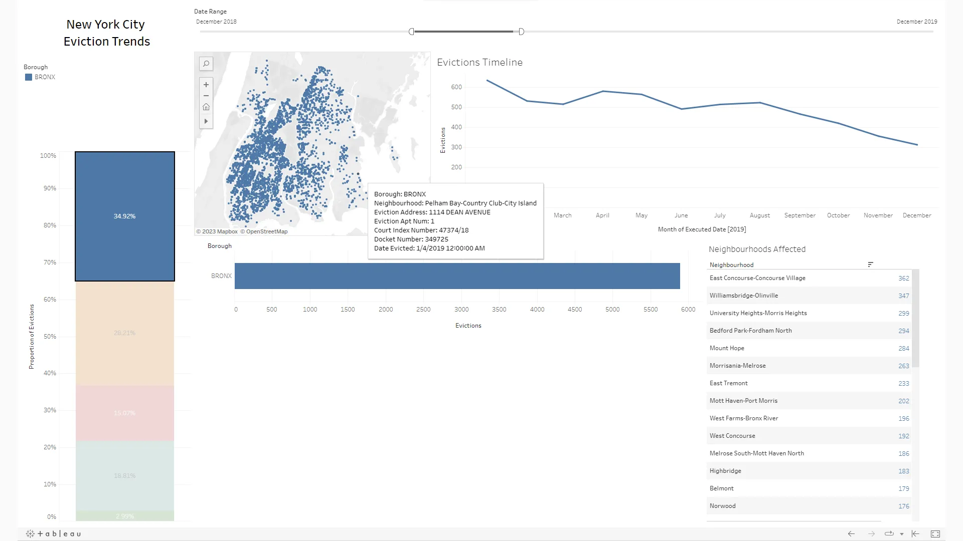
Filtered for the Bronx borough evictions in 2019, with the tooltip displayed on an eviction instance
To list a number of observations taken from the visuals above:
- The Bronx Borough has the highest eviction trends in the city across the entire time period for this report, followed by Brooklyn and Queens.
- There was a clear drop-off in evictions between 2021 and 2022, apparently due to a moratorium on evictions during the Covid-19 pandemic.
- The eviction rate in the Bronx for 2019 appears to decrease steadily with time, which is consistent with the trends of the other Boroughs during this period.
Once again, these examples represent only a small subset of the possible observations that could be taken from the evictions dashboard. Delving deeper into the dashboard could unveil additional insights, which would ultimately support more informed decision-making around eviction resources.
Dashboard 3: Spanish Tourism Trends, 2018–2021
The last dashboard I want to talk through is a dashboard of Spanish tourism trends across all provinces and autonomous regions, from 2018 to 2021. The data for this visualisation was taken from the Spanish government’s open data portal, which can be found here (unfortunately, the Spanish government has not made data available for 2022 or 2023). This has clear business and governmental applications — for example, someone in Spain’s tourism department may use this data to decide where to spend money on developing regional tourism. Similarly, a business may use this data to predict which regions will see the most tourism in a given year. The dashboard can be found at the link here for anyone who wants to explore the data.
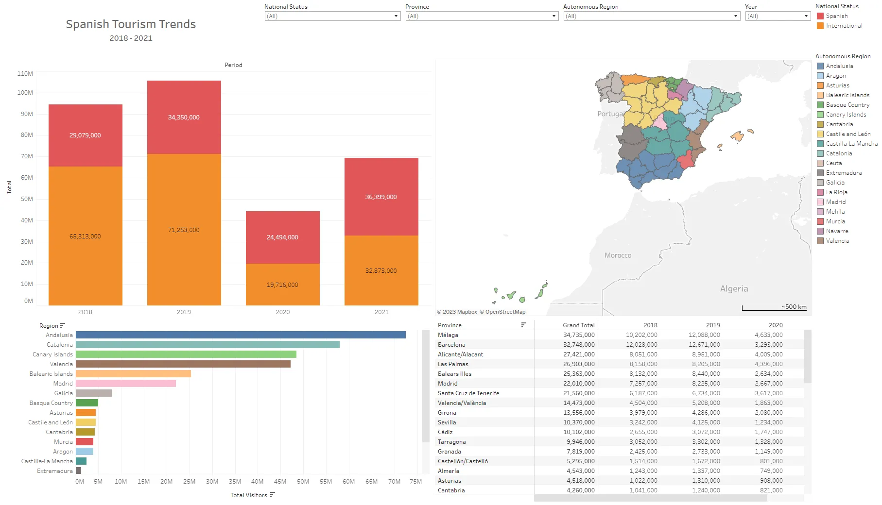
Spanish Tourism Trends, 2018–2021
For this visual I’ve included a stacked column chart showing tourism by year (segmented by the tourist’s national status), a bar plot for tourism by region (which can be expanded to show tourism by province), a matrix showing tourism by province and year, and a map of all the provinces in Spain.
Again, this dashboard is refinable by location — below I have filtered the visual for the Catalonia region, with the province of Barcelona highlighted. A map tooltip shows the tourism details for that province, with a bar chart showing the proportion of Spanish nationals to international tourists during this period.
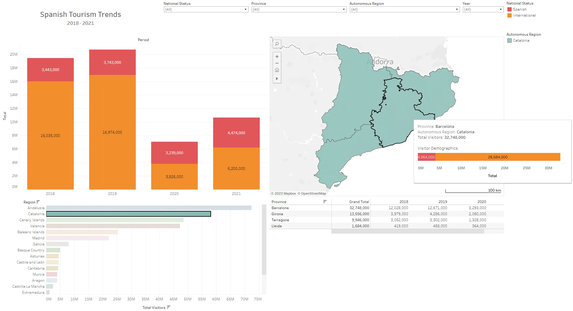
Filtered for Catalonia and displaying tooltip for Barcelona
From examining the graphs in this dashboard, there are a few takeaways worth noting:
- Andalusia, Catalonia, the Canary Islands and Valencia are the most visited autonomous regions in Spain by a wide margin.
- International tourism far outpaced domestic tourism for the years 2018 and 2019 — for 2020 and 2021 the split was roughly equal, most likely as a result of travel restrictions due to the Covid-19 pandemic.
- Tourism to Barcelona province represents over half of the overall tourism to Catalonia, and almost 2.5 times more than the next most popular province in the region (Girona). This is almost certainly due in large part to the city of Barcelona.
Similar analysis and observations can be made of other regions and provinces in Spain, to get a more informed sense of how much tourism can be expected in those parts of the country.
Summary
To summarise, Tableau is a powerful tool for data visualization, allowing users to create concise and impactful visualisations across a wide variety of datasets. I’ve walked through three relatively simple visualisations I recently created in this article, but many other examples can be found on Tableau Public. Many of the visuals which can be found on Tableau are highly intuitive representations of incredibly complex topics, which speaks to the power of these dashboards in visualising these data. The value in these analytical tools lies not only in their ability to generate timely graphs and visuals at speed, but in allowing the data to be presented in clear and intelligent formats, leading to faster analysis and decision making.
References
[1] Mohith Sai Ram Reddy et al. (2023). Salary_Data. Kaggle.
Available at: https://www.kaggle.com/datasets/mohithsairamreddy/salary-data (Accessed: 6 November 2023).
[2] (DOI), D.of I. (2023) Evictions: NYC open data, Evictions | NYC Open Data.
Available at: https://data.cityofnewyork.us/City-Government/Evictions/6z8x-wfk4 (Accessed: 7 November 2023).
[3] Diaz, J. (2020, December 29). New York Approves Eviction Moratorium Until May. NPR. [Online]
Available at: https://www.npr.org/sections/coronavirus-live-updates/2020/12/29/951042050/new-york-approves-eviction-moratorium-until-may (Accessed: 7 November 2023).
[4] Instituto Nacional de Estadística (MINISTERIO DE ASUNTOS ECONÓMICOS Y TRANSFORMACIÓN DIGITAL). (2022). Overnight stays by traveller residence. Provinces. OAT (API identifier: 48427).
Available at: https://datos.gob.es/en/catalogo/ea0010587-pernoctaciones-por-residencia-del-viajero-provincias-oat-identificador-api-48427 (Accessed: 10 November 2023).